If It Ain't Broke: The Character Redesigns That Left Fans Mourning the Original
There's a particular kind of grief that hits anime fans when a redesign drops and it just... doesn't feel right. Not wrong in a dramatic, lawsuit-worthy way — just quietly, frustratingly off. Like when your favorite restaurant changes their recipe and insists it's an improvement, but something essential is gone and you can't quite explain it to someone who wasn't there for the original.
Character redesigns are a normal part of how anime evolves. New seasons get bigger budgets. Remakes attract fresh animators with different sensibilities. Manga art shifts over years, and adaptations have to make calls. All of that is understandable. But "understandable" doesn't mean "good," and the anime community has a long memory for the versions of characters we fell in love with before someone decided they needed a makeover.
Let's talk about it.
The Modernization Trap
One of the most common culprits behind a bad redesign is what you could call the modernization trap. Studios look at an older character design — maybe something from the early 2000s or even the 90s — and decide the sharp lines, unconventional proportions, or busy details feel dated. So they smooth everything out. They make the eyes a little more generic, the hair a little more manageable, the overall silhouette a little cleaner.
The result is technically more polished. But polish isn't the same as personality.
Older designs often had a roughness to them that communicated something real about who a character was. Jutting chins, asymmetrical features, fashion choices that looked almost awkward — these weren't mistakes. They were decisions that gave characters visual weight. When you iron all of that out in the name of modernity, you're not upgrading the character. You're genericizing them.
Anime fans in the US have been especially vocal about this in online spaces, particularly when remakes of beloved older series start rolling out with character sheets that look like they could belong to literally any other show airing that season.
When Remakes Forget What Made the Original Special
Remakes are a minefield for character design, and not every studio navigates them well. The pressure to appeal to new audiences while honoring existing fans creates a push-pull that sometimes results in designs that satisfy neither group.
Take the general pattern: an iconic character from a classic series has a look that's tied to a specific era of animation. Their design is inseparable from the story's tone, the color palette of their world, the way movement was drawn at that time. When a remake rolls in and "updates" that look to match contemporary aesthetics, it can feel like the character has been transplanted into a completely different show — technically present but spiritually absent.
Fans notice. They always notice. Social media threads comparing old and new designs routinely go viral, and the sentiment skews heavily toward the original more often than studios probably anticipated when they greenlit the changes.
The Hair Problem (Yes, Really)
It sounds trivial, but hair is one of the most consistent flashpoints in redesign discourse. Original character designs frequently featured elaborate, gravity-defying, or just plain weird hairstyles that became signature identifiers. You could recognize the character from a silhouette alone.
Redesigns have a habit of taming that hair. Making it lay more naturally. Reducing the volume. Streamlining the shape into something that would be easier to animate consistently across a full season.
Again — practical reasoning. But fans didn't fall in love with practical. They fell in love with the ridiculous cascade of spikes or the improbable twin buns or the color-gradient that made zero physical sense but looked incredible. When that gets dialed back, the character loses a piece of their visual identity that no amount of updated shading technique can replace.
Color Palette Shifts and the Vibe They Kill
Beyond shape and structure, redesigns often bring color palette changes that quietly alter a character's entire energy. Muted tones replacing saturated ones. Darker shades swapping in for something that used to pop. Sometimes it's the reverse — a previously subdued design gets punched up into something almost garish.
Color carries emotional information. A character who was designed with dusty, faded tones communicated something specific: maybe weariness, maybe mystery, maybe a kind of melancholy that was central to their appeal. Brightening that palette in a remake might make them look more energetic, but it can also accidentally erase the mood that made them compelling in the first place.
This is one of those things that's hard to articulate in the moment but impossible to ignore once you see the comparison side by side. Old screenshot on the left, new design on the right — and suddenly you understand exactly what you lost.
The Fans Who Keep the Originals Alive
Here's the thing about redesigns that miss the mark: the fandom doesn't just accept them and move on. Fan artists, cosplayers, and dedicated community members actively preserve original designs in ways that sometimes outlast the official updated versions in cultural relevance.
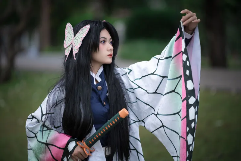
You'll see it in fan art that deliberately references classic character sheets. In cosplay communities where people seek out materials that match the original color specs rather than the remake's. In the way online discussions will almost reflexively pull up old promotional art when debating what a character is "supposed" to look like.
This isn't just nostalgia for its own sake. It's a form of collective curation — fans deciding for themselves which version of a character deserves to be remembered. And they're often pretty ruthless about it.
Redesigns That Actually Worked (They Exist)
In the spirit of fairness, not every redesign is a step backward. Some characters genuinely benefit from a visual evolution — designs that were constrained by the technology or budgets of their original era and finally get to look the way their creators intended. There are remakes where the updated character art feels like a fulfillment rather than a replacement.
But these tend to succeed when the core visual identity is preserved and enhanced rather than replaced. When the new design feels like a conversation with the original rather than a dismissal of it. When you can look at old and new side by side and see a clear lineage, even if the newer version is technically superior in execution.
The redesigns that hurt are the ones where that lineage is broken. Where the new version could have walked out of a completely different franchise and nobody would have questioned it.
What Studios Could Learn
If there's a takeaway from years of fan frustration with character redesigns, it's that visual identity is worth protecting. The quirks, the era-specific style choices, the design decisions that seem weird on paper — these are often exactly what fans bonded with. Smoothing them away in pursuit of a more contemporary or universally appealing look frequently produces the opposite of the intended effect.
Listening to the community before finalizing major redesigns isn't a radical idea. Neither is being honest about what makes a character design work and being conservative about which elements actually need updating.
Fans will always have the receipts. They will always have the old screenshots. And they will always, without exception, have opinions about which version looked better.
Spoiler: it's usually the original.